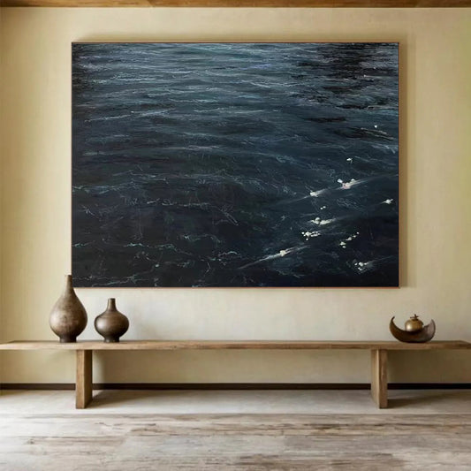
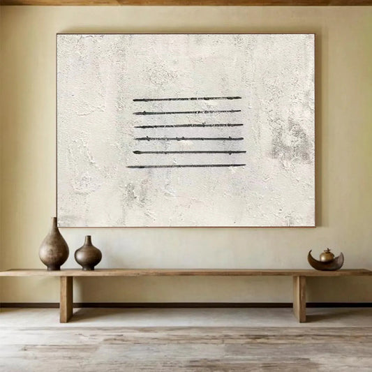
Collection: Office Wall Art

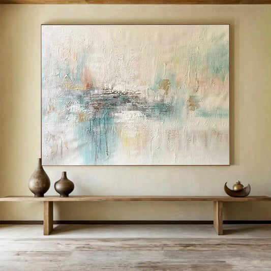
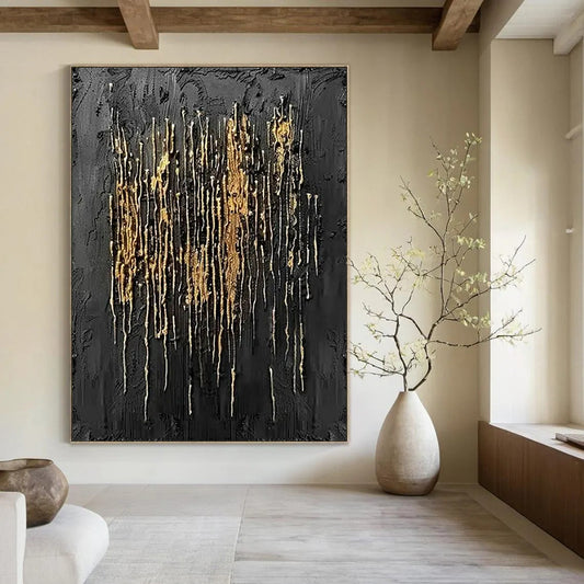
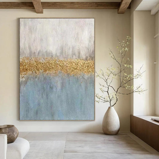
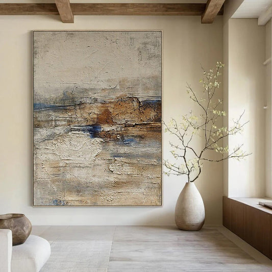
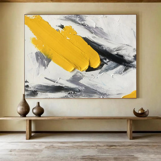
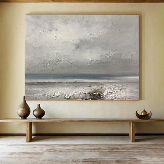
Office wall art is a meeting-length decision: one handmade canvas quiet enough to sit behind a call, structured enough for a reception. These pieces are painted to order—mid-value fields, a clear split—not a beach or a bouquet wearing an office tag. Measure the span the camera actually sees. Browse below and send that width if standard sizes miss.

Office Wall Art

How to Choose Office Wall Art That Can Survive a Meeting

An office wall has two audiences that a living room does not. A visitor sees it for twenty minutes. A camera sees it for eight hours. Office wall art has to hold both without becoming the agenda. “Creativity booster” is a slogan. What you can specify is glare, chroma, and whether a stranger can sit with the canvas without reading it as décor.

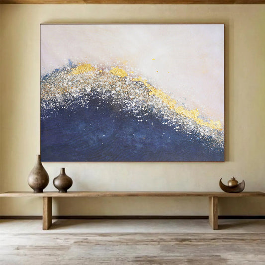
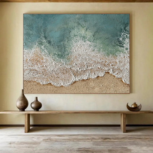
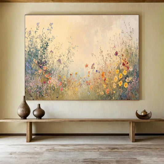
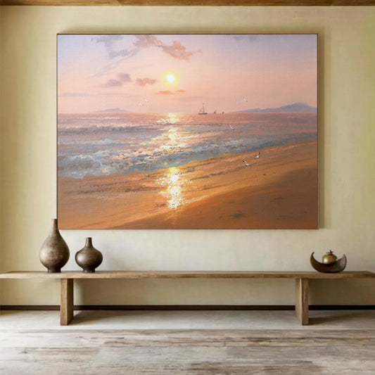
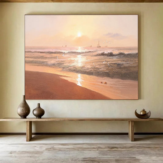
Office Wall Art in this collection should mean hand-painted canvas for a reception plane or the wall behind a desk. The live grid also offers gilded waves, beach sand, and wildflower reverie under the same label. Those are other rooms. A client does not need a holiday behind your shoulder.

Structure before personality

Josef Albers spent decades proving that color is not a fixed fact. MoMA’s Homage to the Square: Silent Hall is nested squares of unmixed paint, each band changing the one beside it. He said color is the most relative medium in art, and that we never really see what we see. That sentence is an office specification. The same navy reads colder under LED panels than it did in the product photo. Gold on a crest will jump when a ring light hits it. A quiet gray-blue divide will sit. A pastel meadow will not, once the overheads are on.

Tate’s glossary on minimalism names the other useful refusal. Frank Stella’s line—“What you see is what you see”—is harsh, and it is the right test for a conference wall. No attempt to represent a shore, a flower, or a mood you have to explain. The object is the plane. A reception can take a clearer structure than a private study. Neither needs a caption in the first five minutes of a meeting.

Wikipedia’s article on Constructivism is the historical version of the same brief: art built for modern rooms, not decorative stylization pasted onto them. You are not commissioning a manifesto. You are borrowing the habit. Office art should be assembled—bands, a split, a field—rather than illustrated. If the title needs “ocean” or “wildflower” to finish the picture, it is the wrong wall.

A working split:

  • Reception: one plane a visitor sees before the desk. Mid values, clear structure, no private joke.
  • Behind the camera: the rectangle the other person actually crops. Quieter than the reception piece.
  • Shared workspace: chroma low enough that nobody has to live with your taste all day.
  • Beach and bouquet: leave them. They date a professional room faster than a bad chair.

The camera and the LED are materials

Sit in the chair. Open the camera. Photograph the wall at 10 a.m. and at 4 p.m. with the lights you actually use. Measure the width visible in the shot, not the whole office. Measure the height from the credenza or monitor line to the ceiling in that frame. Note the window that will stripe one side.

Give the canvas most of that visible span so the call does not crop a timid square floating in drywall. A horizontal field usually fits a desk wall. A tall pier beside a filing run can take a vertical plane. Do not hang a second extra-large rectangle on the same plane as dual monitors. Two glowing boxes and one shouting canvas is a traffic jam.

Overhead LEDs are cool and flat. They bleach pale peaks and turn glossy gold into a second sun on camera. Mid values and a matte or satin surface are the spec. High white ridges that look expensive in a thumbnail become noise in a grid of faces. Deep plaster behind a rolling chair also collects dust in a room you occupy all day.

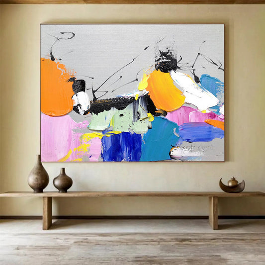
Color should be steady without being beige fog. Oak and walnut sit with olive, clay, and warm gray. White laminate and cool LEDs sit with ash, slate, and a muted blue divide. Navy can work if the gold stays a note, not a surf line. Neon, carnival pink, and a named beach will dominate a small frame and date the call. If the company has an accent color, share a temperature and keep the canvas quieter than the logo.

What an office canvas should refuse

Refuse the living-room splash. Refuse printed texture that dies under LEDs. Refuse a picture so busy that a visitor reads it instead of the page. Refuse a small square centered over a wide credenza. Handmade layers are the advantage in a room of duration: a scraped trough, a band that is not perfectly taped, a ground that keeps heat from floating. Look for angled close shots, oil or acrylic on canvas, painted to order. Approve photos before it ships. Custom width exists for the span the camera sees.

A short buying order

  1. Open the camera and photograph the wall other people see.
  2. Measure that frame, not the whole office.
  3. Choose structure over a shore or a bouquet.
  4. Match temperature to furniture and LED color, not to a logo.
  5. Keep sheen low enough that a face stays the brightest object.
  6. Review photos of the finished canvas before it ships.

Office wall art is a meeting-length decision. One handmade quiet plane finishes the room. A mural that wants a standing ovation does not.

Should office art face the visitor or sit behind the desk?

Face the visitor in a reception. Sit behind you if the camera is the public room. Do not put extra-large work on both planes; the office can carry one main wall.

Will a beach painting look unprofessional on a call?

Usually. A named shore reads as leisure. A mid-value field with a clear split reads as considered. If you have to explain the canvas in the first five minutes, it is too loud.

Can the same piece work in a home office and a client room?

Only if the chroma stays quiet. A private study can take more climate. A room other people use has to be livable for people who did not choose the painting.

Do overhead LEDs ruin textured paintings?

They flatten peaks and turn pale ridges into glare. Choose mid relief and a matte or satin finish. Ask for fewer white and gold high points if the listing looks snow-capped.

How large should the canvas be relative to a desk wall?

Size it to the rectangle the camera crops, which is often narrower than the whole wall. A canvas that fills that frame looks intentional. A small square in the middle of the shot looks like a leftover.

Can I order a quieter field between a window and two monitors?

Yes. Send the visible width, a camera screenshot, and a photo with the overhead lights on. Keep the same structure as the listing, with less gold or less chroma. Approve images of the finished surface before shipping.